Artwork & Colour – What’s it all mean?
23 January 2024
Artwork
Artwork refers to everything on your design that you wish to be reproduced onto a product. The artwork file may include elements such as text copy, images, and other graphics.
How your artwork is presented will be determined by the product to be printed, the quantity and finish required.
Offset Printing – This produces glossy, photographic quality outputs when printing onto plastic. It is most suited to large production runs.
Digital Printing – This process also produces photographic quality outputs. The print process is slower than Offset Printing and so is best suited for 1 – 1000 items.
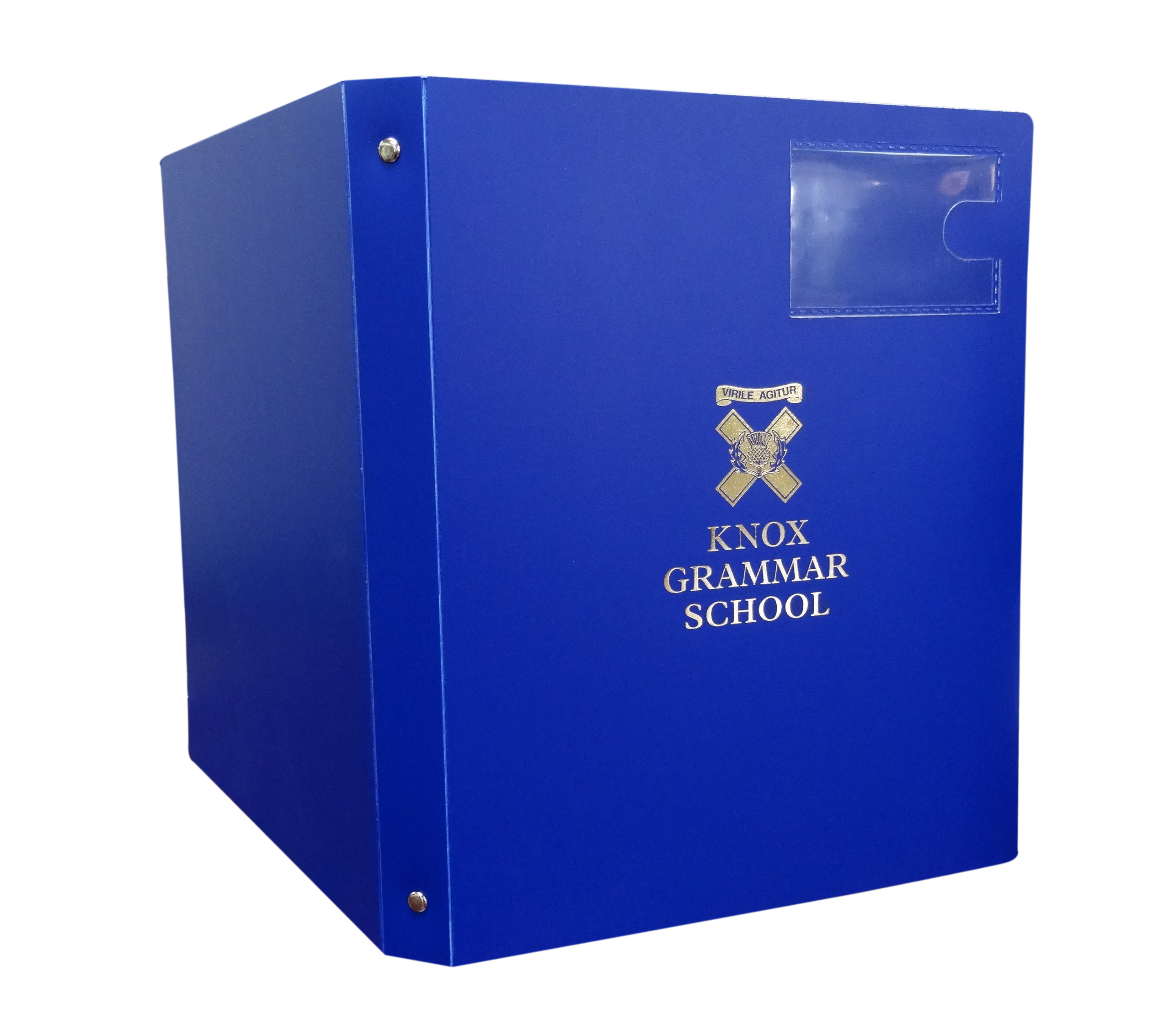
Screen Printing – This print process is ideal for 1 or 2 colour printing in medium runs, or where a PMS colour match is required.
Foil Printing / Foil Stamping – This process results in glossy metallic finishes, typically gold or silver. The stamping process requires a printing plate. There is an up-front cost for the plate, but it can be reused multiple times.
Generally, we prefer artwork to be provided as PDF or EPS files, with High-Resolution Vector Images, with fonts converted to curves, PMS colour separations (if required), trims & bleeds applied.
What does all that mean?
BLEED
Bleed refers to any design element that exceeds the edge of the paper / product, so that when printed there are no visible white edges. If this feature is required, then artwork should ideally be created with a minimum of 3mm bleed.
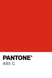
COLOUR – CMYK / RGB / PANTONE PMS
CMYK is a colour mixing method where various percentages of 4 main colours (Cyan, Magenta, Yellow & Black), are used to create the spectrum to be printed.
RGB – Red Green Black
RBG is the colour mixing profile generally used in computer screens. All colours on your screen are generated by applying various intensities of red, green or blue light. RGB profiles can be applied to print but is less common and will produce an output substantially different to how it is presented on screen.
PMS, or Pantone Matching System, is a proprietary numbering system for colours used in graphic design. It includes both solid and process colours.
- Solid colors (sometimes call spot colors) are the truest representation of colour intent in graphic arts. Solid colour printing, also known as spot printing, is the process by which a single colour is formulated and then applied through print.
- Process colors utilize a limited number of inks, such as cyan, magenta, yellow and black (CMYK), applied in different ratios to create a variety of colours. Process colours are generally used when colour accuracy or range is less critical.
CROP MARKS
Crop marks are the thin black lines in the corner of a document of artwork element that signify where the edge is to be trimmed.
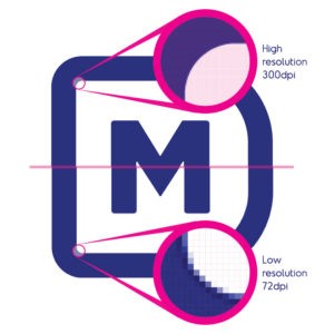
RESOLUTION DPI / PPI
PPI, pixels per inch, and DPI dots per inch are often used interchangeably. The higher the PPI / DPI count on an image the higher the resolution of the image. Images of 300 DPI or more are considered ‘high resolution’ and are generally good for printing. Although if the finished product is to be a large image, artwork with a 600DPI is preferred. Images of 72DPI are generally only suitable for digital purposes such as web pages.
VECTOR VS BITMAP
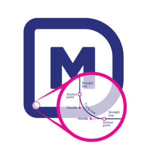
What is a Vector Image?
Vector images are made up of lines and curves joined together via anchor points set by mathematical calculations.
Advantages: infinitely scalable without impacting quality.
Apply exact colour values
(PMS, CMYK, RGB). Easy to edit.
Export to bitmap. Perfect for logos, illustrations, setting type, line drawings, and graphics.
File sizes are typically smaller when compared to bitmap files.
Disadvantages: not a photo editing program.
Handy tip: A vector image performs and behaves like an infinitely expandable rubber band. The edges will always remain sharp.
What is a Bitmap Image?
Bitmap images are made up of tiny coloured pixels/dots arranged to a grid (dpi: dots per inch).
Bitmap images are resolution dependant.
High resolution: 300dpi – photo realistic.
Low resolution: 72dpi – online use.
Advantages: photographic quality.
Photoshop
editing tools/features/filters allowing for artistic freedom and spectacular realistic results.
Disadvantages: when scaling, pixels are added or removed, resulting in pixelation and lower
image quality.
(Extracted from “Tips for Production Ready Artwork eBook” by Martey Daley Graphic Design
WHAT IF I DON’T HAVE ARTWORK IN THE PREFERRED FORMAT?
No problem. We understand that not everyone has access to a Graphic Designer or Art Department in house. Most organizations will however have access to some basic logo files – jpgs, png files and the like. These are usually lower in resolution than preferred – but they’re a starting point.
Not sure – send us what you’ve got. We can generally make most things work.
PROOFING
Before your job goes to production, we will provide you with a Printing Proof.
This is a digital representation of the product being manufactured with your artwork images placed in position, and to size.
Sometimes it is necessary to retouch the images, change the sizes or orientation, or even reconfigure the logos depending on the printing process to be used.
Approving a proof before printing allows you a final check for errors, such as spelling errors, grammar errors, formatting errors, checking the font style, colours, image placement and orientation.